Whew, that title is a mouthful, but I wanted it to convey that this post is about creating a modal confirmation dialog box using SharePoint 2010's ModalDialog, and a little jQuery. In the process, we'll take a look at how this compares with using the jQuery UI dialog.
Before we start, you can download this solution over at the TechNet Gallery here: http://gallery.technet.microsoft.com/SharePoint-2010-Confirmatio-06a8ebc5
Recently, I needed to show a confirmation box to users who wanted to submit some data on a custom application page. Now, this is easy enough using some basic javascript and the "confirm" function. These work great and are super quick and easy to implement. However, they have an extremely basic look and feel, and just seem old. I wanted to do same thing with the SP.UI.ModalDialog in SharePoint.
Now usually when I need a modal dialog, I got straight to jQuery UI's Dialog. These are easy to implement, have great documentation, and oh yeah, REALLY easy to implement. But with this situation, the client was using the out of the box SharePoint 2010 MasterPage, so I wanted my dialog to match the UI of SharePoint. With jQuery and a little custom javascript this was easy to implement and it looks and works great.
Let's take a look at how we manage this, and how it compares to using jQuery UI.
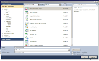
First, we'll just create a Empty SharePoint project and deploy it as a Farm solution, we'll call it "ConfirmationModal".
![]()
Next, we'll right click the solution and choose "Add New Item", and choose Application Page. We'll call it "ConfirmationModal.aspx". We'll add another page in the exact same way, and call it "ConfirmationModalJQUI.aspx".
![]()
At this point we now have a SharePoint Mapped Folder called "Layouts" that has a folder called "ConfirmationModal" which contains our two pages. Now, let's add two folders under "Layouts" to hold our CSS and Javascript files. Right click "Layouts" and choose Add -> New Folder. Name one folder "css" and one "js". The naming here matches what comes down when downloading jQuery, so it eases the import process. Download jQuery UI and add these files to your solution (jQuery will come with the UI files, so you can download just once). Now, let's add two more files: "ConfirmationModal.css" and "ConfirmationModal.js". These will be a blank stylesheet and a blank Javascript file that we'll use for our needs. After all this, your solution should look like the following:
![]()
As you can see we are adding references to the jQuery library, our custom Javascript file, and our CSS.
Next we'll add the following code to the Main content area:
So I'll do my best to break down what we have here:
This is as simple as I could make it (not really, but kind of). All we have here is a display:none on the main DIV which hides it on page load. Next there is some simple styling so the inner DIV looks nice and centered once it is displayed.
Now for the Javascript:
This will require a little more explanation:
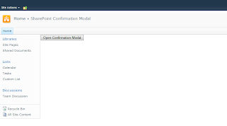
That's it! At this point we have a full solution to present a user with a SharePoint modal confirmation box. Running this page, we get the following:
![]()
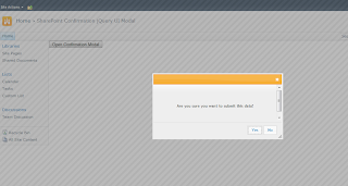
Clicking the button gives us the modal as expected:
![]()
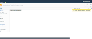
Clicking the Yes or No will close the modal and give a notification:
![]()
And that's it! You now have a confirmation modal dialog that fits right into the SharePoint framework and looks like it came right out of the box!
OK, so now let's look at how this would work with jQuery UI. First, the PageHead will look a little different as we need to include the UI CSS and Javascript, we are placing this into our "ConfirmationModalJQUI.aspx" page:
Next our Main content will also look a little different:
As you can see, we pretty much have the exact same DIV here, but we've stripped the buttons out. We'll keep the same container and inner DIVs, this way we do not need to change our CSS! Also, we've changed the function call of the button, which now calls SubmitDataJQUI().
Finally, let's look at the Javascript:
This is where the biggest changes come into effect. With jQuery UI we can define the buttons that show up on the modal as well as define their functions when clicked. So here we are defining a Yes and No button and their functions simply close the modal and display the notification, exactly like our other modal!
Running this page, we get another modal, just with a different look:
![]()
Clicking one of the buttons fires its function and we get the exact same result as the SharePoint modal.
So there you go, two confirmation modals that do the same thing, but in different ways. Again, I wanted to create a modal that fit perfectly into the UI of out of the box SharePoint 2010. Using a couple of Javascript functions this was pretty straight forward and easy to do. Hopefully what this post shows is that both methods are very similar. jQuery UI is more streamlined and faster to implement, but sometimes you don't have access or the ability to add something like jQuery. Even without the core jQuery, the SharePoint modal shown here can easily be implemented with a few small changes.
You can download this solution over at the TechNet Gallery here: http://gallery.technet.microsoft.com/SharePoint-2010-Confirmatio-06a8ebc5
Enjoy!
Before we start, you can download this solution over at the TechNet Gallery here: http://gallery.technet.microsoft.com/SharePoint-2010-Confirmatio-06a8ebc5
Recently, I needed to show a confirmation box to users who wanted to submit some data on a custom application page. Now, this is easy enough using some basic javascript and the "confirm" function. These work great and are super quick and easy to implement. However, they have an extremely basic look and feel, and just seem old. I wanted to do same thing with the SP.UI.ModalDialog in SharePoint.
Now usually when I need a modal dialog, I got straight to jQuery UI's Dialog. These are easy to implement, have great documentation, and oh yeah, REALLY easy to implement. But with this situation, the client was using the out of the box SharePoint 2010 MasterPage, so I wanted my dialog to match the UI of SharePoint. With jQuery and a little custom javascript this was easy to implement and it looks and works great.
Let's take a look at how we manage this, and how it compares to using jQuery UI.
First, we'll just create a Empty SharePoint project and deploy it as a Farm solution, we'll call it "ConfirmationModal".
Next, we'll right click the solution and choose "Add New Item", and choose Application Page. We'll call it "ConfirmationModal.aspx". We'll add another page in the exact same way, and call it "ConfirmationModalJQUI.aspx".

At this point we now have a SharePoint Mapped Folder called "Layouts" that has a folder called "ConfirmationModal" which contains our two pages. Now, let's add two folders under "Layouts" to hold our CSS and Javascript files. Right click "Layouts" and choose Add -> New Folder. Name one folder "css" and one "js". The naming here matches what comes down when downloading jQuery, so it eases the import process. Download jQuery UI and add these files to your solution (jQuery will come with the UI files, so you can download just once). Now, let's add two more files: "ConfirmationModal.css" and "ConfirmationModal.js". These will be a blank stylesheet and a blank Javascript file that we'll use for our needs. After all this, your solution should look like the following:

Now we have everything we need to create our two types of modal dialogs. We'll start with the SharePoint dialog.
In our "ConfirmationModal.aspx" application page, we'll add the following code to the PageHead:<asp:ContentID="PageHead"ContentPlaceHolderID="PlaceHolderAdditionalPageHead"runat="server"><scripttype="text/javascript"src="/_layouts/ConfirmationModal/js/jquery-1.8.0.min.js"></script><scripttype="text/javascript"src="/_layouts/ConfirmationModal/js/ConfirmationModal.js"></script><linkrel="Stylesheet"type="text/css"href="/_layouts/ConfirmationModal/css/ConfirmationModal.css"/></asp:Content>As you can see we are adding references to the jQuery library, our custom Javascript file, and our CSS.
Next we'll add the following code to the Main content area:
<asp:ContentID="Main"ContentPlaceHolderID="PlaceHolderMain"runat="server"><!-- Button to open the modal --><inputtype="button"id="btnOpenConfirmationModal"value="Open Confirmation Modal"onclick="SubmitData()"/><!-- Modal that will be shown --><divid="divConfirmationModal"><divid="divConfirmationModalInner"><p> Are you sure you want to submit this data?</p><inputtype="button"value="Yes"class="ms-ButtonHeightWidth btnConfirmationModalYes"/><inputtype="button"value="No"class="ms-ButtonHeightWidth btnConfirmationModalNo"/></div></div></asp:Content>So I'll do my best to break down what we have here:
- A button that simply opens the modal. This is strictly for demo purposes, we just need something to trigger the modal, nothing better than a button. It has a click event which calls the SubmitData() Javascript function.
- A couple of DIVs. The first is a container DIV, this is strictly to hold the other contents and apply our hidden CSS so its invisible. The inner DIV holds the message and the buttons.
- A message letting the user know they can cancel the data submission.
- Two buttons, and Yes and a No.
#divConfirmationModal{display : none ;
}#divConfirmationModalInner{text-align : center ;
padding :40px ;
}This is as simple as I could make it (not really, but kind of). All we have here is a display:none on the main DIV which hides it on page load. Next there is some simple styling so the inner DIV looks nice and centered once it is displayed.
Now for the Javascript:
// Document Ready function that attaches click events for our SharePoint modal buttons$(function () {
$(".btnConfirmationModalYes" ).live("click" , function () {
SubmitDataCallback(SP.UI.DialogResult.OK);
});$(".btnConfirmationModalNo" ).live("click" , function () {
SubmitDataCallback(SP.UI.DialogResult.cancel);
});});// Confirmation fuction for SharePoint Modalfunction SubmitData() {
var _html = document.createElement( );
_html.innerHTML = $("#divConfirmationModal" ).html();
var options = {
title: "Confirm Data Submission" ,
width: 400,
height: 200,
showClose: false ,
allowMaximize: false ,
autoSize: false ,
html: _html
};SP.UI.ModalDialog.showModalDialog(options);
}// Callback function called when a confirmation button is clickedfunction SubmitDataCallback(dialogResult) {
if (dialogResult === SP.UI.DialogResult.OK) {
SP.UI.ModalDialog.commonModalDialogClose(dialogResult, 1);
SP.UI.Notify.addNotification("You closed the modal, with the Yes button." , false );
}if (dialogResult === SP.UI.DialogResult.cancel) {
SP.UI.ModalDialog.commonModalDialogClose(dialogResult, 0);
SP.UI.Notify.addNotification("You closed the modal, with the NO button." , false );
}}This will require a little more explanation:
- Document.Ready function: In this function we simply attach some click events to our buttons inside the modal. Its pretty straight forward, we attach a click function that calls the SubmitDataCallback function with a SP.UI.DialogResult enum. This enum is used later to check which button was clicked. We are using the jQuery .live function instead of the .click function. This is because later, we are taking the inner DIV HTML and putting it into another DIV, thus creating another copy of the buttons. The .live function allows for any new elements to get this event, so it works nicely.
- SubmitData function: This is called to show the modal dialog. The first thing that happens is to create an HTML element. The SharePoint dialog requires either a URL to show a page, or HTML to show. However, it has to be an HTML element, you can not just give it a string of HTML (which is unfortunate). So we create the HTML element, a DIV in this case, then using jQuery we grab the inner DIV HTML from our modal. Next, we creare an options object and give it all the info the dialog will need. Finally we call the SP.UI.ModalDialog.showModalDialog, passing it the options object.
- SubmitDataCallback function: This function is called when one of our modal buttons is clicked (attached via the .live from above). This function simply checks the dialogResult parameter to see which button was clicked. After that we close the dialog, then show a notification via the SP.UI.Notify.addNotification call.
That's it! At this point we have a full solution to present a user with a SharePoint modal confirmation box. Running this page, we get the following:
Clicking the button gives us the modal as expected:

Clicking the Yes or No will close the modal and give a notification:
And that's it! You now have a confirmation modal dialog that fits right into the SharePoint framework and looks like it came right out of the box!
OK, so now let's look at how this would work with jQuery UI. First, the PageHead will look a little different as we need to include the UI CSS and Javascript, we are placing this into our "ConfirmationModalJQUI.aspx" page:
<asp:ContentID="PageHead"ContentPlaceHolderID="PlaceHolderAdditionalPageHead"runat="server"><scripttype="text/javascript"src="/_layouts/ConfirmationModal/js/jquery-1.8.0.min.js"></script><scripttype="text/javascript"src="/_layouts/ConfirmationModal/js/jquery-ui-1.8.23.custom.min.js"></script><scripttype="text/javascript"src="/_layouts/ConfirmationModal/js/ConfirmationModal.js"></script><linkrel="Stylesheet"type="text/css"href="/_layouts/ConfirmationModal/css/ConfirmationModal.css"/><linkrel="Stylesheet"type="text/css"href="/_layouts/ConfirmationModal/css/ui-lightness/jquery-ui-1.8.23.custom.css"/></asp:Content>Next our Main content will also look a little different:
<asp:ContentID="Main"ContentPlaceHolderID="PlaceHolderMain"runat="server"><!-- Button to open the modal --><inputtype="button"id="btnOpenConfirmationModal"value="Open Confirmation Modal"onclick="SubmitDataJQUI()"/><!-- Modal that will be shown --><divid="divConfirmationModal"><divid="divConfirmationModalInner"><p> Are you sure you want to submit this data?</p></div></div></asp:Content>As you can see, we pretty much have the exact same DIV here, but we've stripped the buttons out. We'll keep the same container and inner DIVs, this way we do not need to change our CSS! Also, we've changed the function call of the button, which now calls SubmitDataJQUI().
Finally, let's look at the Javascript:
// Confirmation fuction for jQuery UI Modalfunction SubmitDataJQUI() {
$("#divConfirmationModal" ).dialog({
modal: true ,
height: 200,
width: 400,
buttons: {"Yes" : function () {
$(this ).dialog("close" );
SP.UI.Notify.addNotification("You closed the modal, with the Yes button." , false );
},"No" : function () {
$(this ).dialog("close" );
SP.UI.Notify.addNotification("You closed the modal, with the NO button." , false );
}}});};This is where the biggest changes come into effect. With jQuery UI we can define the buttons that show up on the modal as well as define their functions when clicked. So here we are defining a Yes and No button and their functions simply close the modal and display the notification, exactly like our other modal!
Running this page, we get another modal, just with a different look:
Clicking one of the buttons fires its function and we get the exact same result as the SharePoint modal.
So there you go, two confirmation modals that do the same thing, but in different ways. Again, I wanted to create a modal that fit perfectly into the UI of out of the box SharePoint 2010. Using a couple of Javascript functions this was pretty straight forward and easy to do. Hopefully what this post shows is that both methods are very similar. jQuery UI is more streamlined and faster to implement, but sometimes you don't have access or the ability to add something like jQuery. Even without the core jQuery, the SharePoint modal shown here can easily be implemented with a few small changes.
You can download this solution over at the TechNet Gallery here: http://gallery.technet.microsoft.com/SharePoint-2010-Confirmatio-06a8ebc5
Enjoy!